CHICAGO JAZZ FESTIVAL POSTER & BROCHURE
OVERVIEW
BRIEF
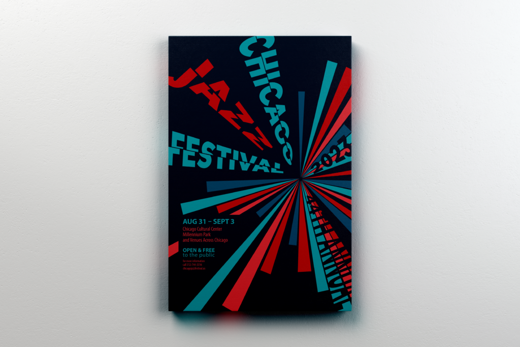
The goal of this project was to create a brochure and matching poster for the annual jazz festival, based on a particular era of jazz as well as complimentary adjectives.
My adjectives : Loud & Energetic.
Font: Myriad Pro is a sans-serif font used for print and Web as it is easy to read on screen. With the different weight variety, it is a great font for newsletters.
INITIAL POSTER CONCEPTS
APPROACH #1
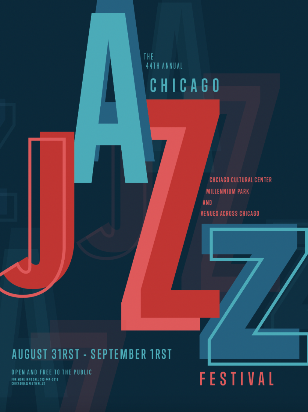
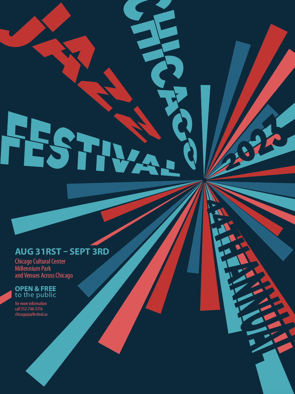
To embody the words ‘loud’ and ‘energetic,’ I began creating designs utilizing the letters as shapes. This involved making the word ‘Jazz” bigger than all other typography on the design. The color scheme was also meant the loud, vibrant red and blue.
APPROACH #2
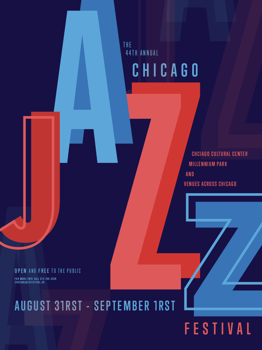
I attempted the same design but using a louder blue. I also wanted to create a design where the typography stood out more, so I deepened the shade of blue in the background.
APPROACH #3
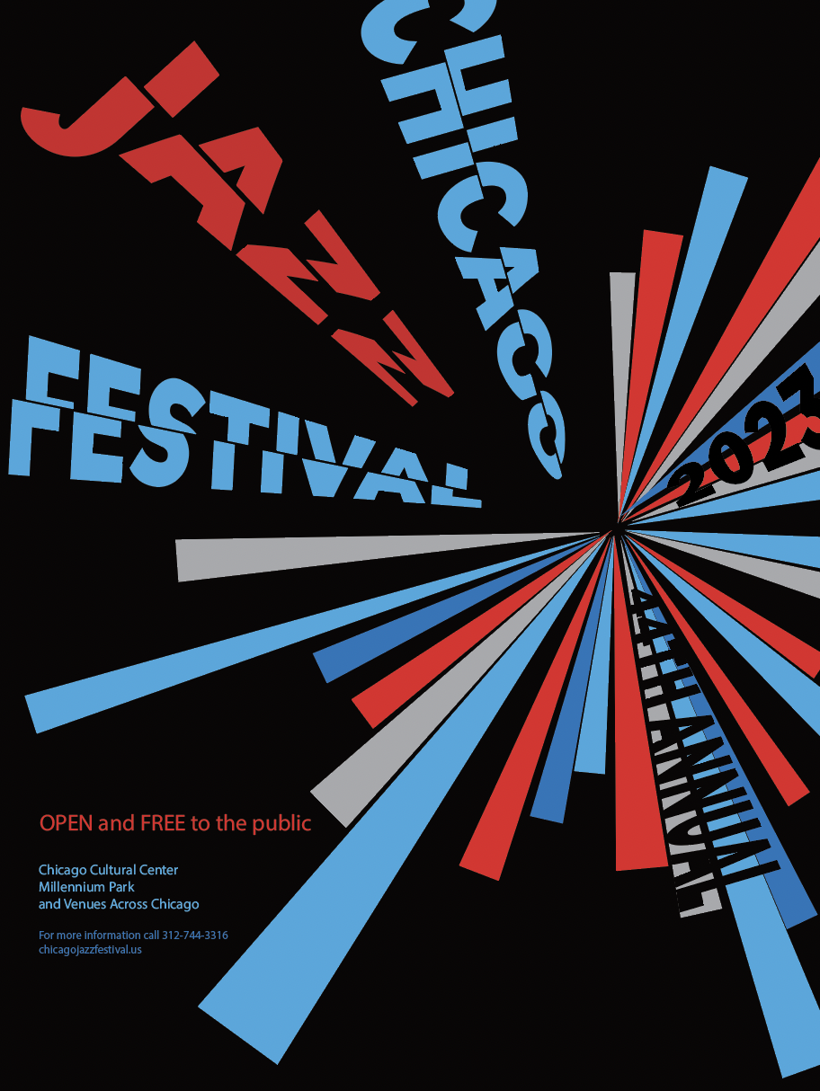
Realizing my previous designs did not convey ‘energetic’ as much as I desired, I realized I needed to warp the typography and create an energetic shape. I used sunbeam-like shapes to create a burst of color. Conforming to the shape of these beams, I have warped the typography to follow this movement.
BROCHURE

FRONT & BACK
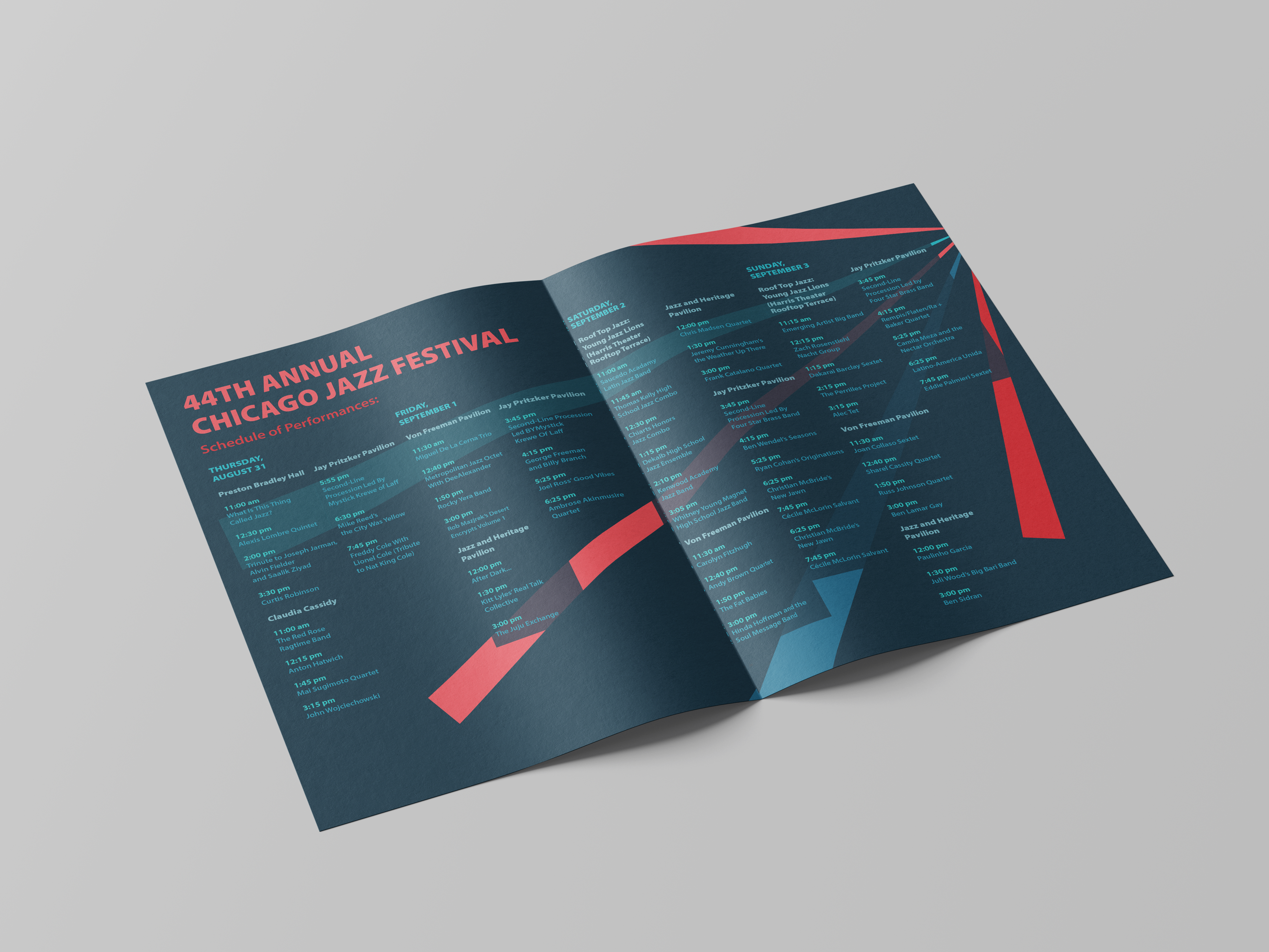
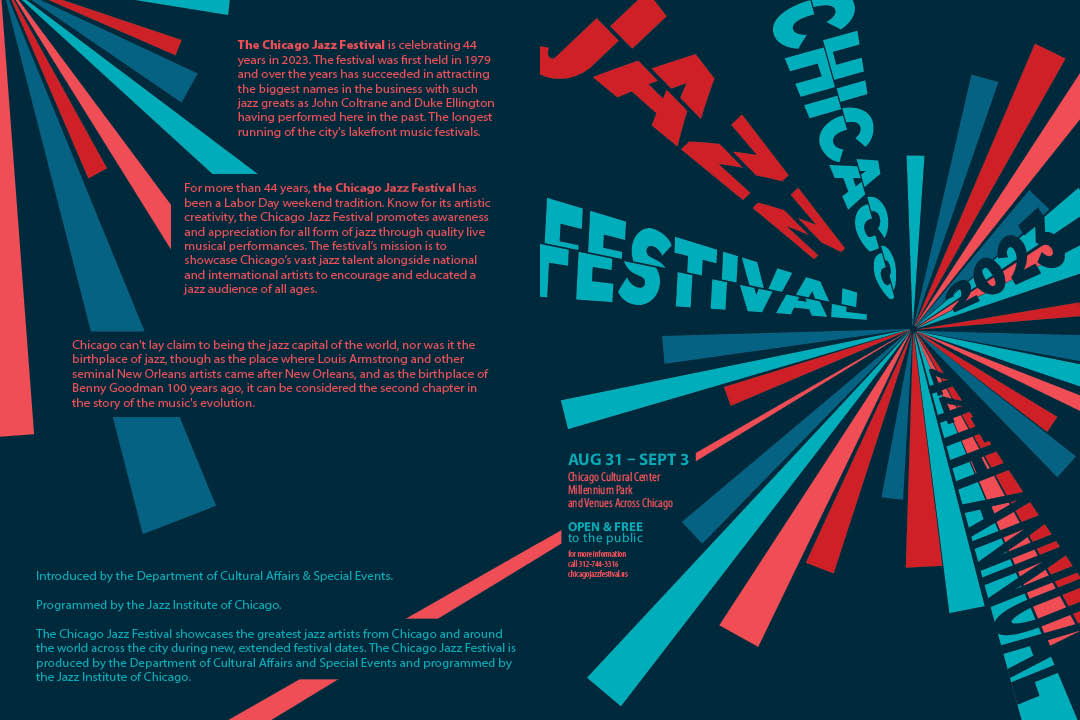
Beams of the bursting illustration on the cover spread onto the back, behind the typography.
INSIDE SPREAD
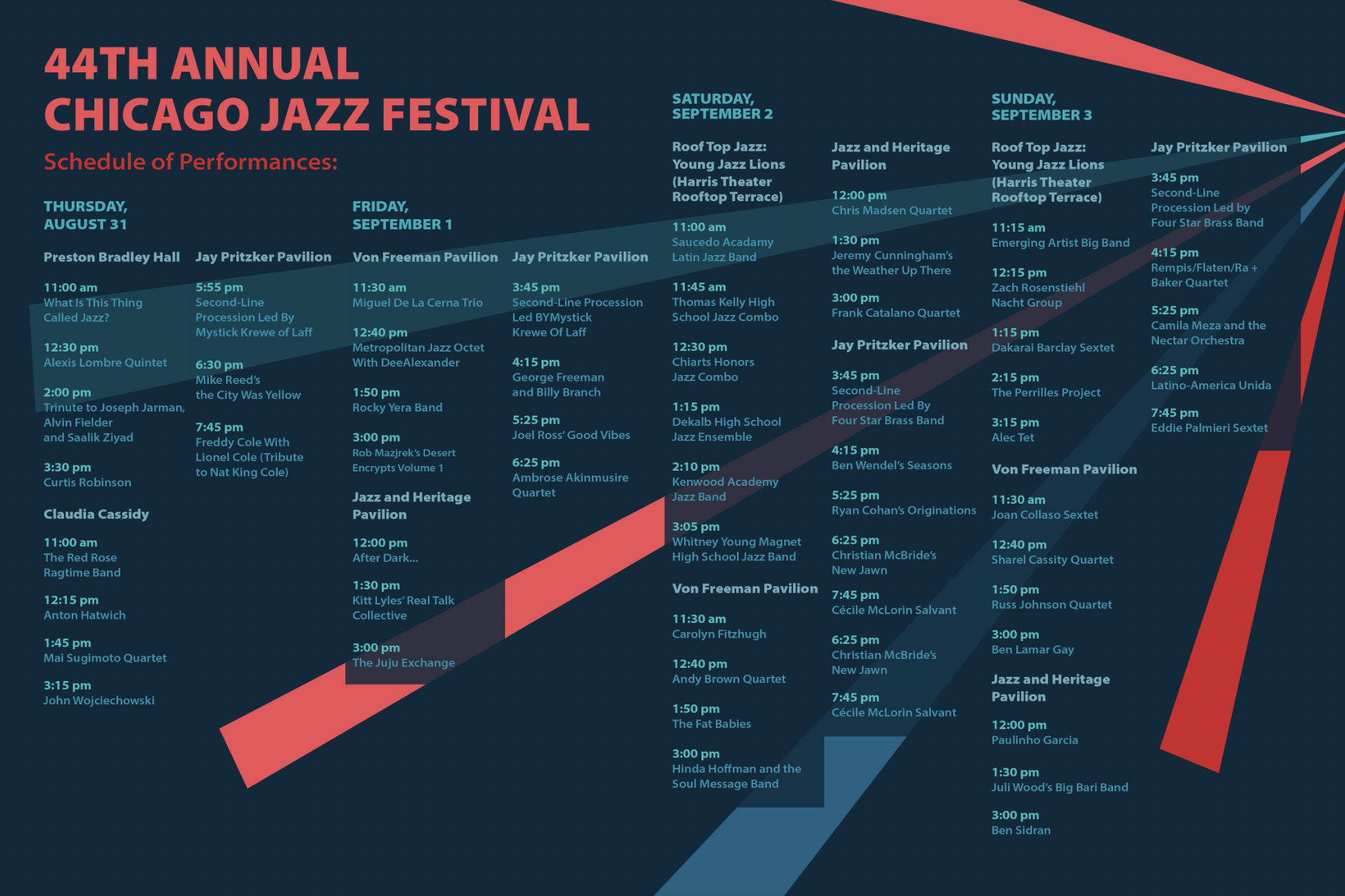
The inner spreads of the brochure contain the dates of the festival, organized by venue and date. The main header is the day of the event, with subheads for each venue.
FINAL PRODUCT
POSTER
BROCHURE
SADEY HAVEL
GRAPHIC DESIGNER


