PACIFIC INK LOGO
OVERVIEW
LOGO BRIEF & INITIAL SKETCH
Name: Pacific Ink
Nature of Business: Manufacturer and supplier of high-quality ink products.
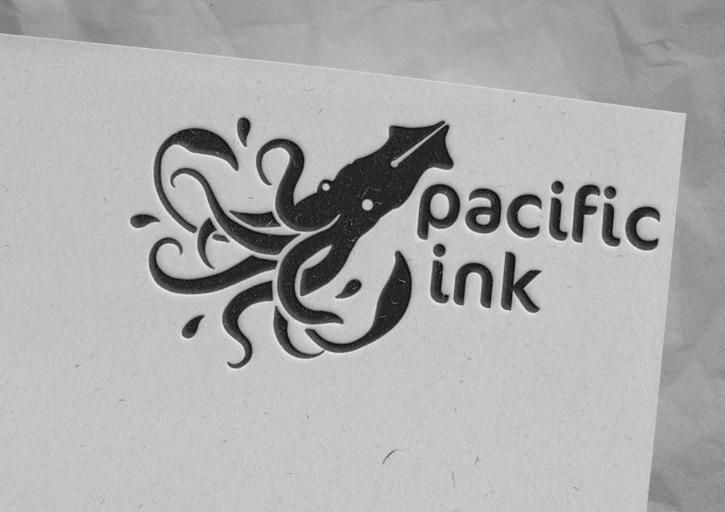
Main Element: A squid dripping with ink to represent the core product: high-quality ink.
Font: Cocon Pro is a rounded yet rather asymmetrical font with details reminiscent of brush-strokes. This pairs well with the fluidity of the organic shape of the squid and corresponding ink droplets.
PROGRESS
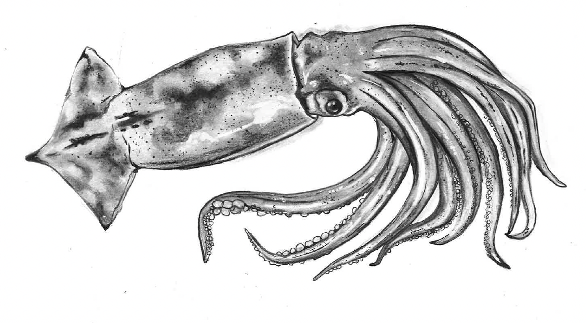
Initial
1/6
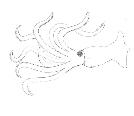
2/6
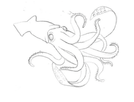
3/6
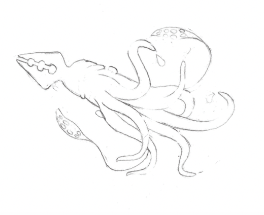
4/6
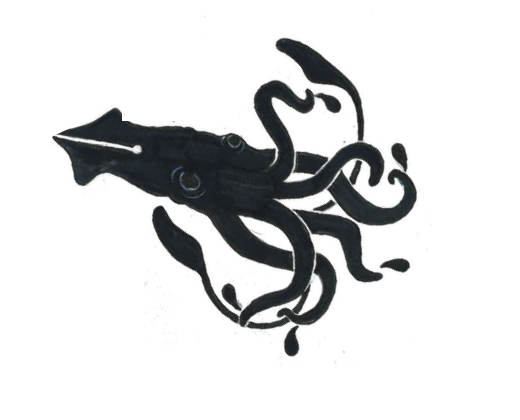
5/6

Final
6/6
LOGO USAGE DOS
Background Usage: Use the logo on a white or a light, solid-colored background whenever possible. If a dark background is necessary, use the inverted white version of the logo with proper contrast.
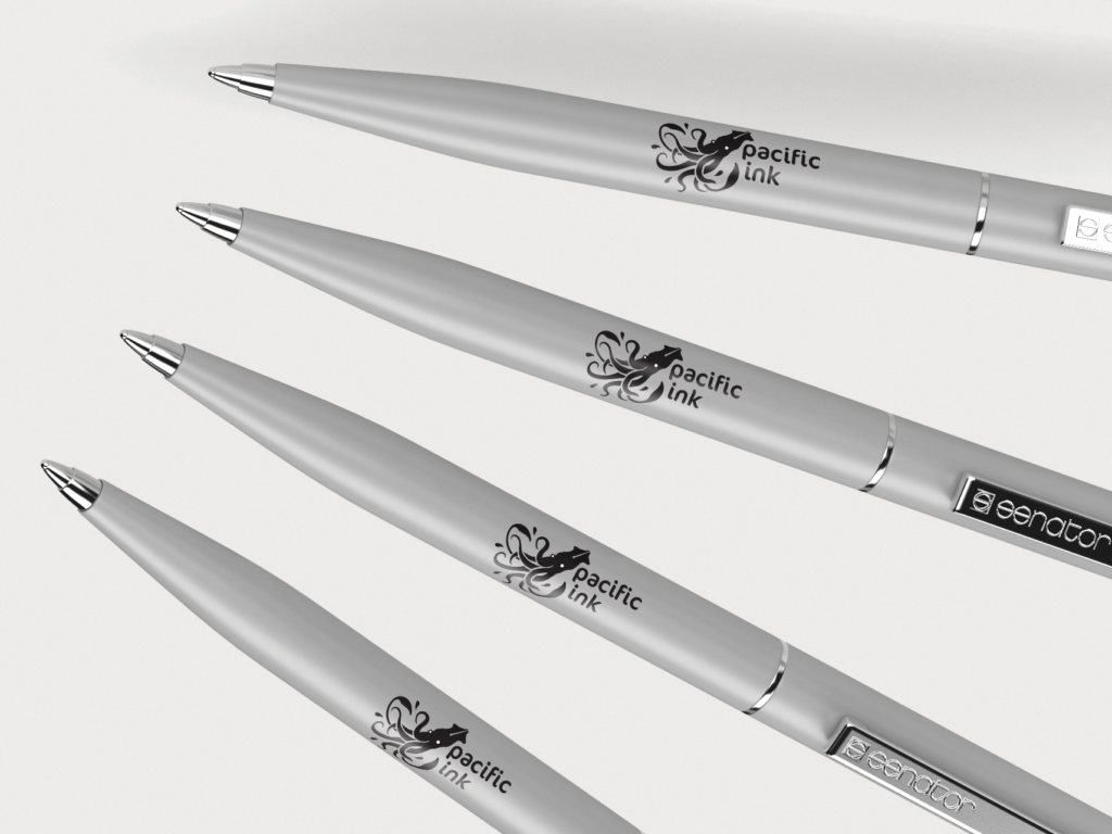
Merchandise Usage: The logo can be used on stationery items such as pens, notebooks, letterheads, banners, buildings, product packaging, and ads. Logo can also be used without name.
Space: Allow for clear space around the logo to prevent visual clutter. The minimum distance from other elements should be at least equal to the height of the letter ‘f’ in the logo.


LOGO USAGE DON’TS
Color Alterations: Avoid grayscale or monochrome versions. Maintain the original color integrity.
Unauthorized Additions: Prohibit additions of elements, text, or embellishments to the logo beyond squid and ‘pacific ink’ text.
Misplacement: Do not place the logo too close to document edges or other graphics.
Inappropriate Backgrounds: Avoid placing the logo on busy or distracting backgrounds.
SADEY HAVEL
GRAPHIC DESIGNER


